


Distinctive and Compelling Brands, Crafted Just for You
At Lagom Design, we believe that every company has its own unique story and identity. We are dedicated to capturing that individuality through distinctive and compelling branding that sets you apart in the marketplace.
Your company’s identity created by Lagom Design will be:
Remarkable
We steer clear of fleeting trends when designing trademarks. Your company is one-of-a-kind, and its trademark and branded elements should reflect that uniqueness. We create bespoke designs that resonate with your core values and vision.
Integrated
A strong brand needs a consistent visual identity that your customers can recognize across all platforms. From business cards to blueprints, signage to stationery, flyers to email footers, we ensure every touchpoint is seamlessly unified and unmistakably yours.
Analyzed
Our process starts with a deep dive into your competitive landscape. We develop logos and visual elements that are meaningful, well-considered, adaptable, and, most importantly, uniquely yours. Every design decision is backed by research and strategic thinking.
Guided
A successful branding project goes beyond the design phase. We provide a comprehensive style guide that equips you with the tools to maintain your new brand identity across all future marketing efforts. This ensures your brand stays cohesive and powerful as it grows.
Lasting, Compelling Identities from Lagom Design

River Market branding
River Market branding
Revitalizing The River Market
The River Market Community Association, a group of business leaders and residents of Kansas City’s original neighborhood, wanted a comprehensive refresh of their branding to better represent their vibrant community. They turned to Lagom Design to rejuvenate their logo and website, capturing the unique essence of this beloved area.
Drawing inspiration from the distinct street grid, set at an angle from the rest of downtown, and the eclectic personality of its residents and businesses, we crafted a brand identity that reflects the dynamic spirit of the River Market. Our design approach celebrated the neighborhood’s rich history while infusing modern elements.
The flexible logo and branding embody the character and charm of the River Market. This comprehensive redesign not only enhances the association’s ability to communicate with its audience but also solidifies the River Market’s standing as a vibrant and essential part of Kansas City. Our work ensures that the refreshed branding will resonate with both longtime residents and newcomers, celebrating the past while looking forward to the future.


Rapid KC branding
Rapid KC branding
The Jewel of the Road
Establishing a transportation company from the ground up is a formidable challenge, one that Rapid KC has embraced with determination. As a multifaceted intermodal logistics company, Rapid KC seamlessly integrates import/export services, fumigation, transloading, and brokerage under one roof. When they approached Lagom Design, their goal was to create a brand identity that clearly communicated their comprehensive and efficient process.
Inspired by their commitment to clarity and client services, we developed a brand that embodies these qualities through a distinctive jewel icon, symbolizing their crystal-clear communications and streamlined operations. The two-tone letterforms, reminiscent of polished chrome, reflect the sleek and modern nature of their services. The result is a cohesive and striking brand identity that Rapid KC proudly stands behind.


Smith & Boucher branding
Smith & Boucher branding
Evolution Over Revolution
Smith & Boucher, an MEP engineering firm, urgently needed a refreshed brand, as their existing assets dated back to the early 2000s. Their logo appeared outdated, and its colors were challenging to reproduce. Lagom Design embarked on an in-depth exploration of the company’s rich 50-year history to find authentic inspiration.
We unearthed a timeless Bauhaus-like ligature from the 1980s and seamlessly paired it with modern typography. Adding a touch of history, we incorporated a quirky ampersand from the company’s earliest documents. The result included a refined color palette featuring slate grey and energetic orange, embodying both sophistication and dynamism.
Collaborating closely with Smith & Boucher’s principals, we developed stationery, graphics, and templates that are not only visually stunning but also easy for their team to implement. The new brand now reflects Smith & Boucher’s storied past while projecting a vibrant, contemporary image.


MIAA Conference branding
MIAA Conference branding
A Unified Identity for a Growing Conference
The Mid-America Intercollegiate Athletics Association (MIAA), an NCAA Division II conference founded in 1912, has a long and respected history rooted in Missouri and Kansas. When the conference expanded beyond its traditional geographic footprint in 2010, it became clear that the existing logo—an outline of the two states—no longer reflected its membership.
Lagom Design was tapped to develop a new visual identity that could unify all member institutions under a single, timeless symbol. Drawing inspiration from the hexagon—a shape found in beehives and long associated with strength and cooperation—we created a logo that reflects the spirit of community, competition, and shared values among the conference’s schools.
As alumni of MIAA institutions ourselves, we took special pride in contributing to a brand that honors the conference’s history while embracing its future. The result is a modern, meaningful identity designed to leave a lasting impact across generations of athletes and fans.


Van Osdol branding
Van Osdol branding
75 Years-Old and Brand New
Van Osdol, a 75-year-old law firm, initiated a name change that led to a comprehensive rebrand. They entrusted Lagom Design to create a new brand identity that honors their legacy while projecting a thoroughly modern image.
Inspired by the simplified name, we designed a streamlined logo that embodies both seriousness and innovation. This new visual identity reflects the firm’s commitment to top-tier legal services.
The result is a cohesive, powerful brand that reinforces Van Osdol’s position as a leader in the legal industry, poised for future success. This project exemplifies our ability to blend tradition with modernity, creating a brand that resonates with the firm’s history and future ambitions.


Energy Tech Solutions branding and website
Energy Tech Solutions branding and website
Energy Tech Solutions, a specialist in HVAC and plumbing systems for commercial and industrial environments, sought to develop a technical brand that would resonate with building owners and engineers. Their goal was to establish a brand identity that accurately reflected their expertise in designing, installing, and maintaining mechanical and plumbing systems.
Lagom Design crafted a distinctive brand for Energy Tech Solutions, utilizing a palette of blues to symbolize cool air and flowing water, effectively conveying their core services and technical proficiency. This new branding exudes professionalism and technical acumen, appealing directly to their target audience.
In addition to the branding, we developed a robust website on the WordPress platform, serving as a primary contact point for service requests. The site is designed to be user-friendly and scalable, allowing Energy Tech Solutions to expand its content as their service offerings grow. Since the website’s launch, Energy Tech Solutions has successfully enhanced its online presence, reflecting their continued growth and the broadening scope of their services.
This comprehensive branding and website initiative has positioned Energy Tech Solutions as a leader, ensuring they effectively communicate their expertise and reliability to both existing and potential clients.


City Barrel Brewing branding
City Barrel Brewing branding
Laying the Groundwork
City Barrel Brewing opened in the Crossroads Arts District of Kansas City in 2018 with a full kitchen and much fanfare around their hip space and exciting beers. The owners turned to Lagom Design to construct the initial visual brand for their brewery and restaurant. We listened to their vision of the business and created a cohesive set of brand assets to kick off their launch.

McCambridge Law branding
McCambridge Law branding
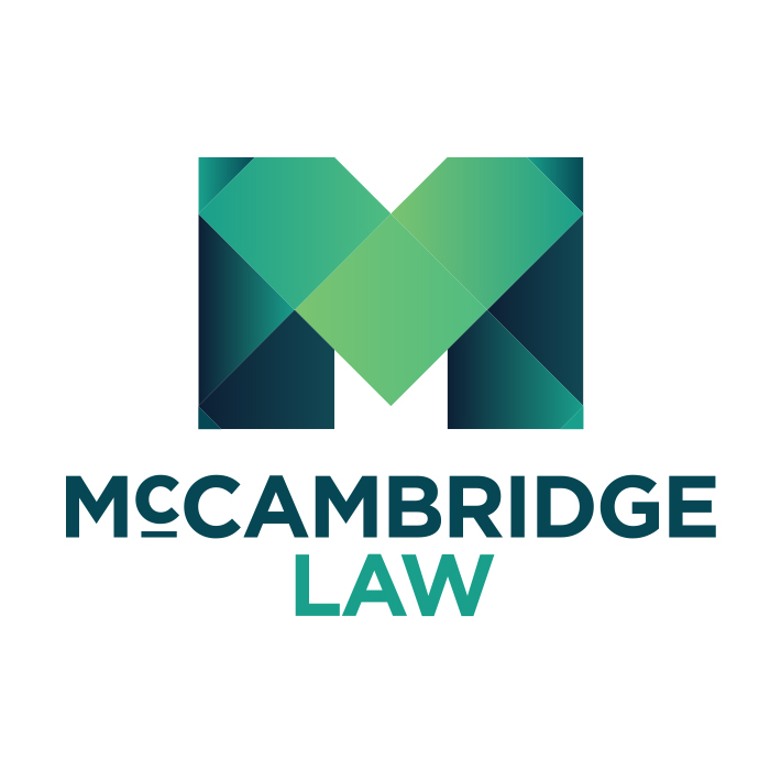
Strength, Compassion, and Heritage
McCambridge Law is dedicated to protecting the legal rights of working women, with a focus on their professional lives and their families. The firm’s mission blends strength and advocacy with a deep sense of empathy and care.
Lagom Design created a branding system that reflects these values—strong and memorable, yet warm and approachable. Subtle nods to the firm’s Irish heritage were woven into the design, adding a personal and meaningful layer to the visual identity. The result is a cohesive brand that communicates trust, professionalism, and the compassionate spirit that defines McCambridge Law.

At Lagom Design, we don’t just design logos and branding elements; we craft experiences that leave a lasting impression. Let’s build something remarkable together.
